Stylization
Experimentation in Simplication
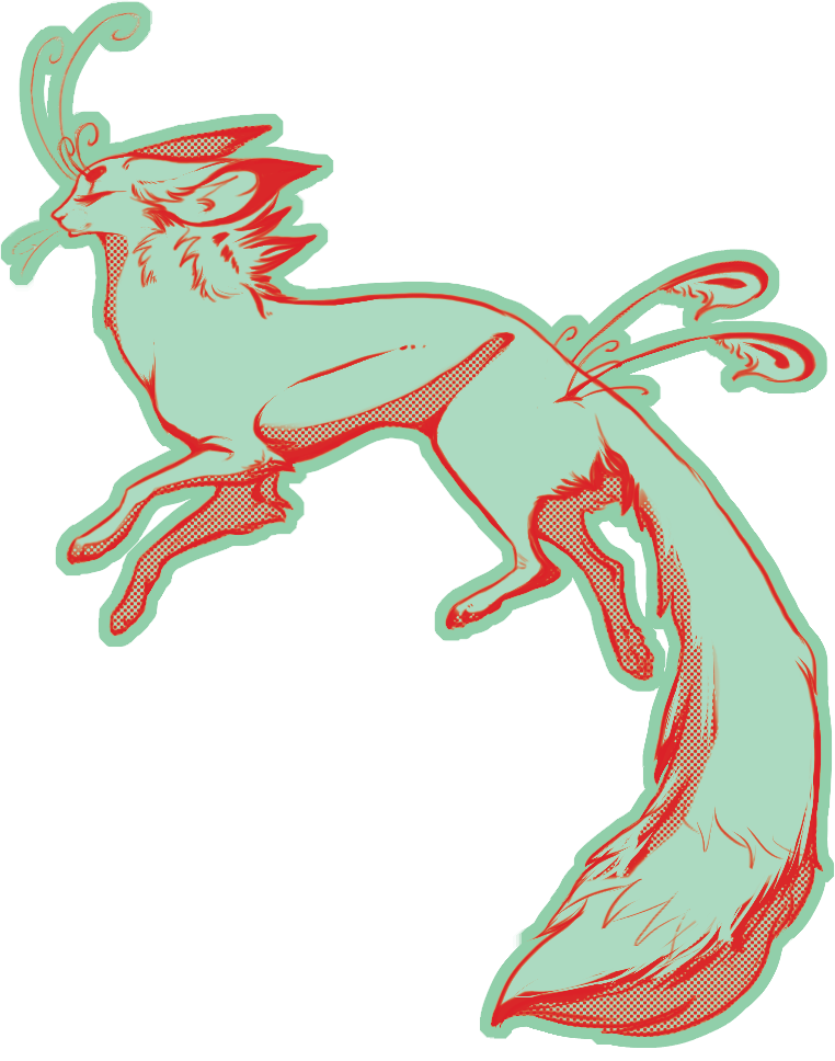
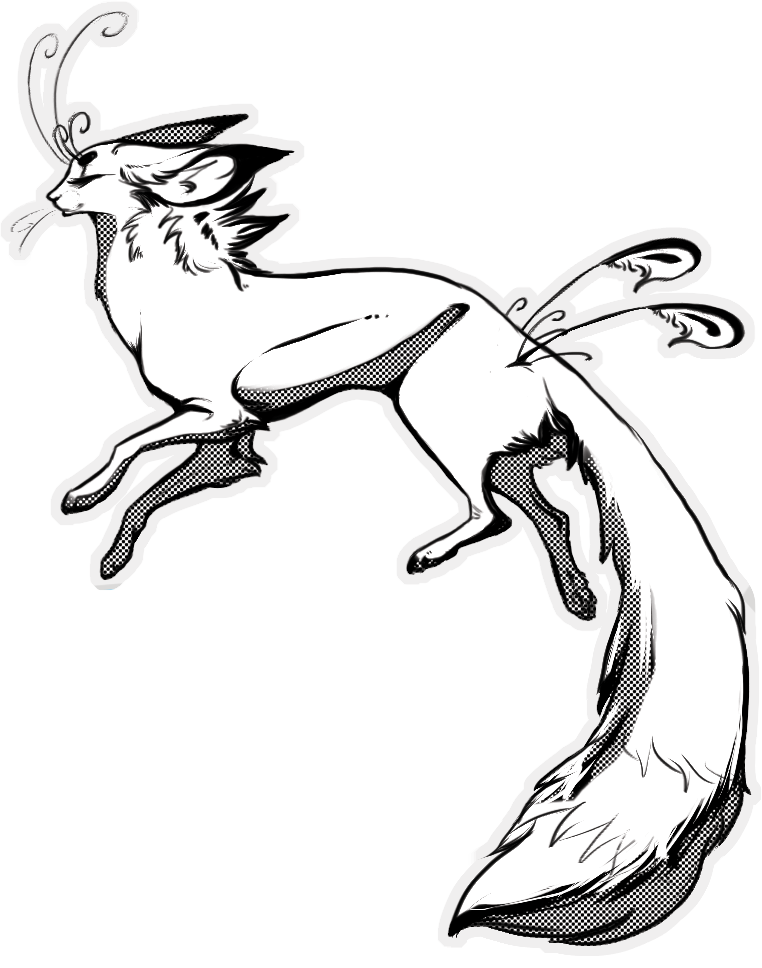
A lot of times I have the tendency to see things as a mashup of parts rather than a gestalt being. In an attempt to create a simple logo for myself, to put in my car window and on my computer, I tried to rip down some preconceived notions I have about stylization and anatomy. I knew I wanted to very simplistic cell shading using halftone rather than gradients. This was a huge departure for my typical style.
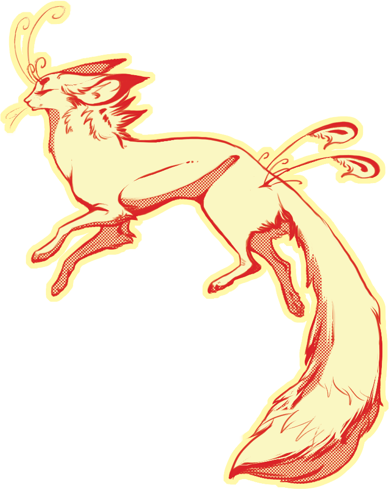
I really liked this first color pass, but with some experimentation and playing with the channel editor in Photoshop, I ended up with several new ideas for color themes. This butter colored one was one of those, keeping the red lines of the first, and using a color I generally never use for a base coat.
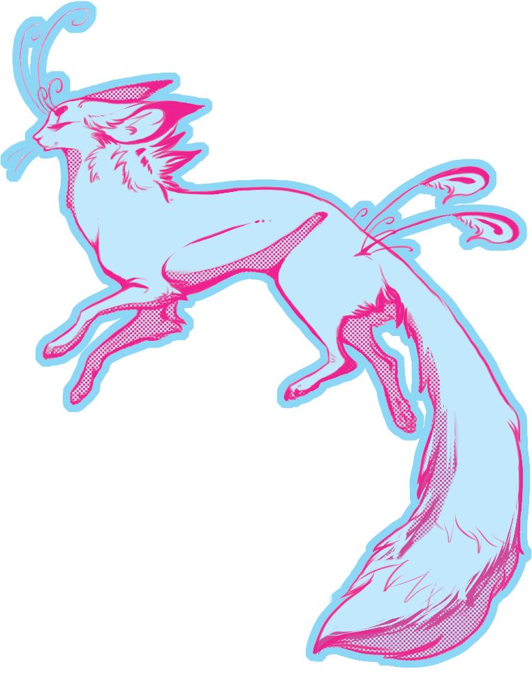
This next one was doubtless my favorite. I thought I liked the mint color of the first pass, but, as it turns out, I really enjoyed this color combination the best.
Finally, I wanted to see what a black and white image would look like.
In conclusion, they turned out way better than I thought, and I ended up making some IOS backgrounds for myself as well as desktop wallpaper. Really great experiment.